Logo
Iodine Mining Company Logo Design
-
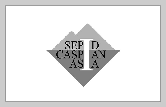
The logo was designed for Sepid Caspian Asia, a company specializing in the production and supply of mineral products, particularly iodine. At the client's request, the letter I, representing iodine, has been prominently incorporated into the logo design.
-
In addition, the company name has been stylized to emphasize the letter I, which appears in all three words of the name. This approach creates a distinctive visual identity while suggesting multiple functions and applications.
-
The dark triangle in the background also serves as a downward-pointing arrow, symbolizing the extraction of minerals from the earth. Its darker color and larger size not only provide a foundation for the main elements of the logo but also emphasize the importance of the earth and the abundance and diversity of its mineral resources.
-
Since iodine can be extracted from marine sediments and deposits, the triangle—particularly its position beneath the mountain symbol—also evokes this method of extraction.
-
Finally, the composition has been carefully balanced by combining the mountain shapes at the top with the triangle at the bottom. Both elements feature 90-degree angles and a roughly square-like vertical form, helping maintain visual balance and symmetry throughout the design.
View Other Projects
All Rights Reserved. © 2026 OmidNegar